Modernism was an attitude towards modern life in favour of universal needs. Reinvent society and redefine human values and ideas, rejecting the past as a model for the art of the present. Geometrical forms, elimination of ornamentation, aesthetics and simplicity are some of the characteristics of a modernist piece. In the Russian Revolution 1917 visual communication became a priority, a tool to speak to people, starting with the propaganda of Constructivism where artists as El Lissitzky began having a responsibility towards society. The dutch movement 'De Stijl' simplified the visual composition to primary colours, black and white and vertical and horizontal directions. The school Bauhaus develop a new approach towards design, combining arts, crafts and design, that traveled across the world, giving importance to functionality, context and content. Bauhaus ideas inspired Jan Tschichold with the book 'Die neue Typographie' limited all fonts but sans-serif and made a kind of Modernist design rules. After Second World War, design became a part of the rebuilt the world somehow. This is the period when high modernism starts. Use of grids and sans-serif typefaces are some characteristics of 'Swiss Style'. Emil Ruder and Armin Hoffman spread around the world this new approach with their manuals. Helvetica emerge in this period becoming the one of the 'modern' typeface, and it is still using a lot in the present time. Wim Crouwel reinterpreting Swiss and Der Stijl ideas found that the designer can solve problems through research and analysis.
Saturday, 7 January 2012
Visual Examples

"Beat the Whites with the Red Wedge"by El Lissitzky.
http://www.designishistory.com/images/lissitzky/BeatTheWhites.jp
The red wedge represent the russian bolshevik and the white is the imperial regime. This poster is an example of constructivist and modernist work.There is no traditional forms or decorative purpose is an aesthetic work.The abstracts geometric shapes and the colours chosen make the perfect function of the poster.
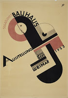
Schmidt, Joost. Bauhaus poster 1923
http://www.bauhaus.de/uploads/pics/plakat_748_02.jpg
This was the first Bauhaus poster full of geometric forms and text into abstract compositions of diagonal bars. It demonstrates early characteristics of the new typography using a sans-serif type. The Bauhaus logo is really visible close to the Bauhaus letters.

Mondrian, Piet. Composition II in Red, Blue and yellow. 1930
It is not a graphic design piece but the ideas of reduction of form and colour are major influences on modernist graphic designers. Limiting himself with just a few colours and the experiment of the relocation of elements it can change the feelings of the viewer. It would not be the same visual reaction if the red square becomes small, and the blue square bigger.

Hofmann, Armin. Giselle, 1959
http://www.internationalposter.com/pimages/SWX01112.jpg
The sans-serif typeface in a vertical direction and the carefully use of the space between letters tell us is a Swiss style piece. Its simple and clear enough. Using a soft photography as the background with a geometrical and strong typography, makes a simple but balance piece.

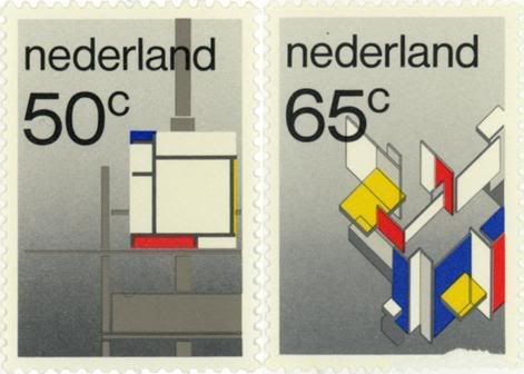
Crouwel, Wim. The Stijl stamps, 1983
http://img.photobucket.com/albums/v681/LouisXIV/art/Mondrian_Stamps.jpg
Even if it is not from the Modernist period, we could say this is a modernist work. Crouwel tried to use typefaces from De Stijl movement but he decided to use helvetica for the final design because the illustration was already from the period. He said in Helvetica (2007) There you can see the solution by the analysis and experimentation he made.
Citations
The architect Ludwig Mies van der Rohe adopted the phrase “Less is more” from a poem of Robert Browning. The phrase is a clear example of the modernist approach towards art and design. Hans Hofman explained really well saying:
“The ability to simplify means to eliminate the unnecessary so that the necessary may speak' From Lecture notes
De Stijl and Bauhaus put this in practice with the elimination of ornaments, and by simplifying the forms and colours the functionality became an important element. Bauhaus students were told that there is no distinction between form and function because “Form follows function” in words of graphic design meant make work appropriate for the period they were living. Herbert Bayer said really clearly that:
'The importance of the Bauhaus is not the result of it's success in developing prototypes for industrial production, which was limited, but rather to the compelling nature of its original idea of collaboration between art, craft, and industry in the education of designers, and the hope that modern design could reshape and unify art and life.' History of Modern Design (2010)
The concept of art and design changed completely after Bauhaus. In 1923 Jan Tshichold after attending the first Bauhaus exhibition, got impressed. This ideas inspired him to make the book 'Die Neue Typographie' (New typography in english):
'The essence of the New Typography is Clarity. This puts it into deliberate opposition to the old typography whose aim was 'beauty' and whose clarity did not attain the high level we require today. This utmost clarity is necessary today because the manifold claims for our attention made by the extraordinary amount of print, which demands the greatest economy of expression.' Just my type: a book about fonts (2010)
He limited typefaces to sans serif types, being more expressive, simplistic and clearer than the serifs. This book help to understand the main ideas of modernist and made a new era for typography. With the Swiss style order was a important point so designers start using grids gradually. Wim Crouwel is one of them, saying that people call him grid-nik for his very strict system of grids.
'For me it's a tool of creating order. And creating order is typography.' Helvetica (2007)
Massimo Vignelli explains the importance of a Swiss characteristic:
'Good typographer always have sensibility about the distance between letters, we think typography is black and white, typography is really white is not even black it is the space between the blacks that really makes the difference.' Helvetica (2007)
Rick Poynor talked about the necessity of Swiss Style in that period, also in Helvetica (2007)
'There was a real sense of social responsibility among designers. And Swiss designers in the 50s were really driving that along. This is when Helvetica emerge in 1957, where there is felt to be a need for rational typefaces which can be applied to all kinds of contemporary information'
Critical Analysis
It has been a hard process to capture the whole image of Modernism. But analysing the works of artists like Piet Mondrian and El Lissitzky, I reach the point why Modernism came and how it changed the way to approach design. In the Russian Revolution, constructivism was an important movement to develop Modernism, it gave a hope to a better world. "Beat the Whites with the Red Wedge"by El Lissitzky is a call for that better world. First and Second World War did not stop people to do things differently, instead intensify the desire and the need to rebuilt, to reconstruct what wars had broken.Art and design was a part of that need. Piet Mondrian painting is clearly related with the change of something new that people needed. If we compare the traditional painting with this modern painting you will not find any similarities at all. And that was designers wanted. After going through all this research I realize that Modernism is the central development of Art and Design that prove that things can be different. It really worked out for that period but became outdated with the time. Rick Poynor explains why this happened.
'As It is always the case with any style there's a law, the more you see the more the public the more the designers uses those typography and graphic solutions the more familiar predictable and ultimately dull they become. And by the 70s especially in America you start to get a reaction against. What it seems to those designers is the conformity, the kind of dull blanket and sameness this way of design is imposing into the world. So it's Something that come out of idealism has by this time become meanly routine and there's a need for a change.' Helvetica (2007)
David Carson was one of those designers who started changing that modernist world, even If he did not know what he was doing.
'I was just experimenting. So when people start getting really upset I just don't understand why. And many years later somebody explain to me that there was this group, they spend a lot of time trying organize things, a kind of system going and they saw me coming and throwing that up the window. An only much later I learned what the term Modernism was.' Helvetica (2007)
There is people who think Modernism is boring and there is people who still live in that period somehow. In my opinion I think Modernism limits you with its strict rules, but at the same time you can find the basis of design in its ideas.
Subscribe to:
Posts (Atom)